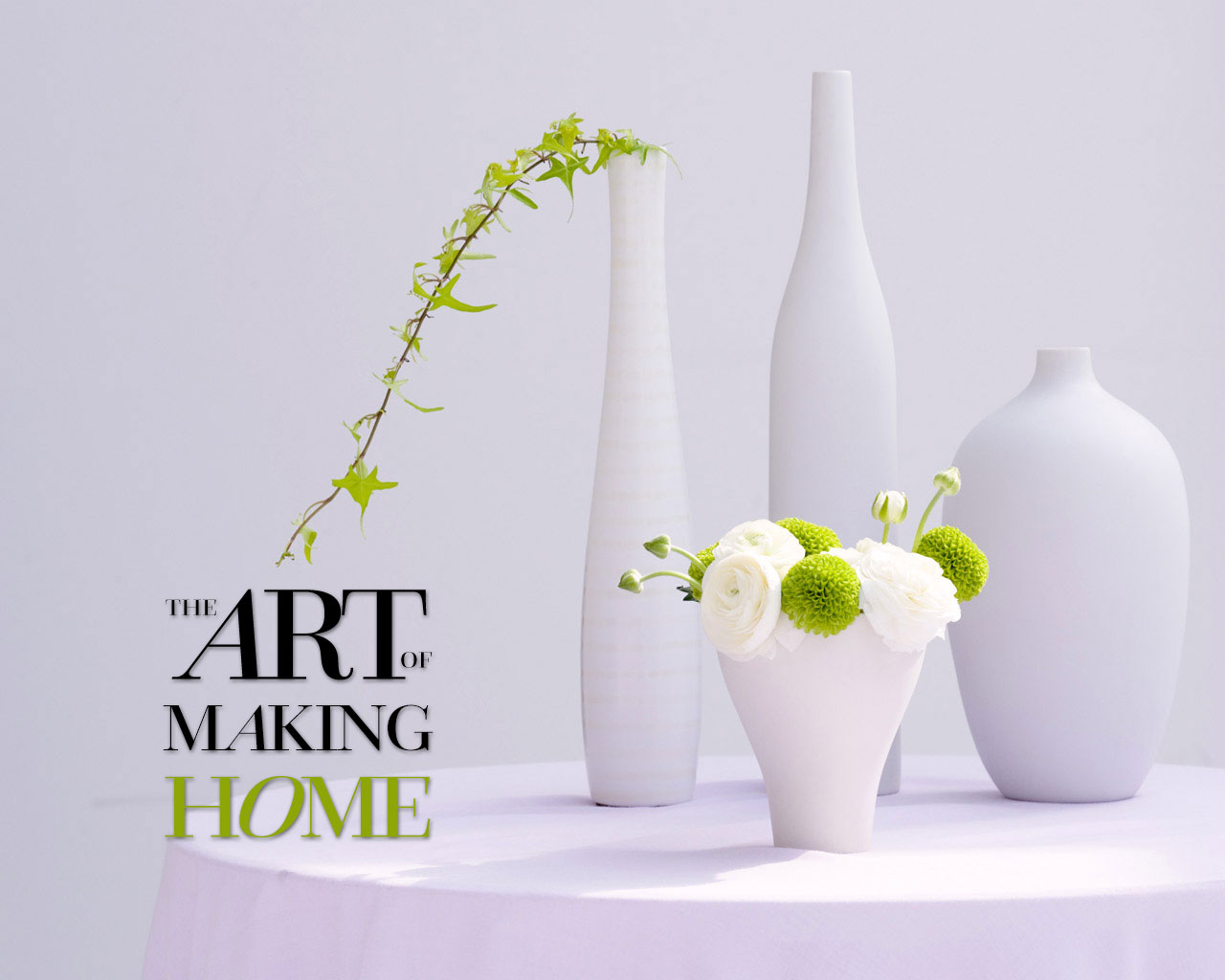
It is a Friday afternoon, not feeling constructive for my normal work so here comes the Procrastiworking project.
This is an attempt to work on my typographic design skill. The space between the letters and lines. What kind of typeface I should use for a certain graphic.
The Process: finding the right serif typeface (Questa Grande), getting the right spacing, coloring, and alignment…
The Result: clean, modern, slick, simple…
Enjoy the weekend!

